Convert Figma to HTML Best Practices & Tools in 2025

Convert Figma to HTML: Best Practices & Tools in 2025

Screenshot of a Figma design

Introduction

Designing a visually appealing and user-friendly interface is only half the battle in web development. The real challenge lies in translating those designs into clean, functional code. With tools like Figma gaining immense popularity among designers, converting Figma files to HTML has become a critical skill for developers. In this guide, we’ll explore the best practices and tools to ensure a seamless transition from Figma designs to HTML code.

Importance of Translating Designs into Code

Effective design-to-code translation ensures that the website or application functions as intended while maintaining the aesthetic and usability envisioned by the designer. A poor conversion can lead to broken layouts, inconsistent styles, and a frustrating user experience, ultimately damaging the brand’s reputation. By adhering to best practices, developers can bridge the gap between design and functionality, creating high-quality digital products.

Why Figma is a Popular Choice

Figma has emerged as a leading design tool for several reasons:

  1. Cloud-Based Collaboration: Figma allows multiple users to work on the same project in real-time, making it ideal for teams.
  2. Cross-Platform Compatibility: It works seamlessly on any operating system with a browser.
  3. Rich Feature Set: From vector editing to prototyping, Figma provides everything designers need in one platform.
  4. Plugins and Integrations: Figma’s extensive plugin library simplifies tasks like asset exporting and code generation.

Preparation

Organizing Your Figma File

Before diving into code, ensure your Figma file is well-organized:

  • Group and Name Layers: Use meaningful names for layers and group related elements logically.
  • Use Styles: Leverage Figma’s text, color, and grid styles for consistency.
  • Create Components: Convert reusable elements into components to streamline development.

Exporting Assets

Efficient asset management is key to a smooth workflow:

  • Export in the Right Formats: Use SVG for vector graphics, PNG for images with transparency, and JPEG for high-quality photos.
  • Set Proper Dimensions: Ensure exported assets match the design specifications to avoid scaling issues.
  • Optimize for Web: Compress images using tools like TinyPNG or Squoosh to reduce load times.
Code snippet examples

Best Practices

Structuring Your HTML

A well-structured HTML file is the foundation of any website:

  • Use Semantic Elements: Elements like <header><section>, and <footer> enhance readability and accessibility.
  • Follow a Hierarchical Structure: Organize content logically using headings (<h1> to <h6>) and subheadings.
  • Add Comments: Document your code for easier maintenance.

Writing Clean, Semantic Code

  • Avoid Inline Styles: Use external CSS files for better scalability.
  • Minimize Nesting: Excessive nesting in HTML can make code harder to read and maintain.
  • Validate Your Code: Use tools like the W3C Validator to ensure your HTML meets standards.

Using CSS Frameworks

CSS frameworks like Bootstrap or Tailwind CSS can speed up development:

  • Bootstrap: Ideal for responsive layouts and pre-designed components.
  • Tailwind CSS: Provides utility-first classes for custom designs.
  • Foundation: Offers a robust grid system and flexible components.

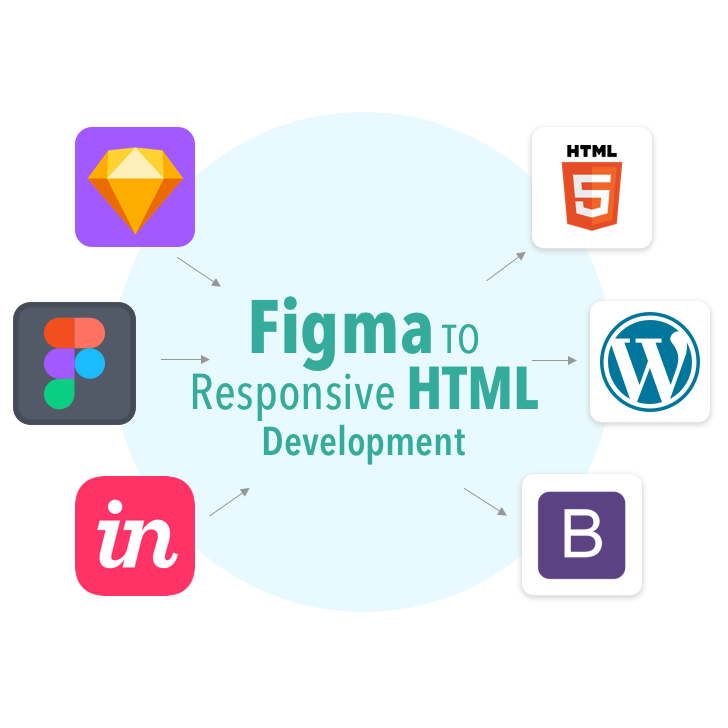
Tools to Streamline the Process

Plugins for Figma

  • Figma to HTML: Export design layers directly into HTML and CSS code.
  • Zeplin: Generates code snippets and style guides for developers.
  • Avocode: Simplifies handoff by converting Figma designs into code-ready formats.

Online Converters

  • Figma to Code: Online tools like Figma2HTML and Anima can generate HTML and CSS from Figma designs.
  • Supernova: A design-to-code platform that supports multiple frameworks.
Comparison of Figma design vs. HTML output

Common Challenges and Solutions

Handling Fonts and Images

  • Fonts: Ensure that custom fonts used in the design are available in web-safe formats like WOFF2. Use @font-face to integrate them.
  • Images: Optimize image sizes and use the srcset attribute for responsive image handling.

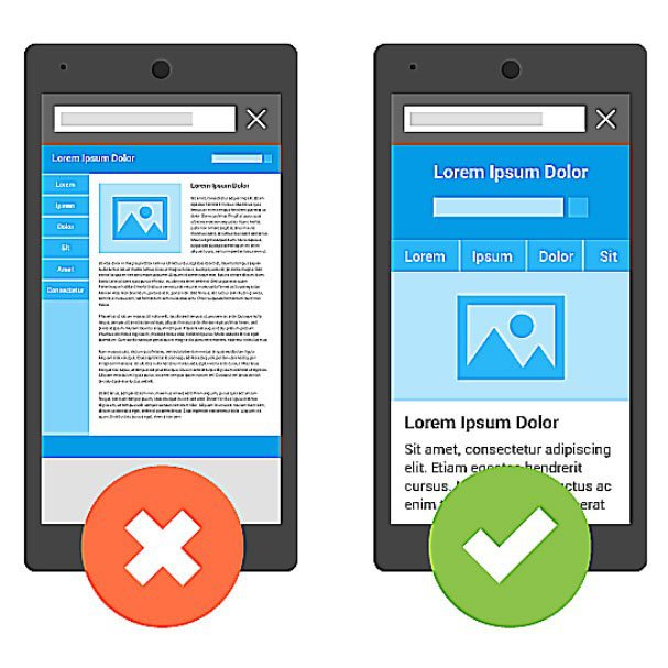
Maintaining Responsiveness

  • Use Media Queries: Define breakpoints to adjust layouts for different screen sizes.
  • Test on Multiple Devices: Tools like BrowserStack or Responsinator can help simulate various devices.
  • Flexible Units: Use relative units like percentages and em instead of fixed pixels.

Conclusion

Converting Figma designs into HTML requires careful planning, attention to detail, and the right tools. By organizing your Figma files, following coding best practices, and leveraging tools and frameworks, you can ensure a smooth and efficient workflow. Remember, the goal is not just to replicate the design but to create a functional, responsive, and accessible website. With these tips, you’re well on your way to mastering Figma-to-HTML conversion.

Why Responsive Web Design Matters in 2025

Why Responsive Web Design Matters in 2025

Examples of responsive vs. non-responsive sites

Introduction

In today’s fast-paced digital world, having a website is no longer enough. The way users interact with the web has changed dramatically, especially with the proliferation of mobile devices. Responsive web design (RWD) has become a cornerstone of modern web development, ensuring that websites provide a seamless experience across various devices. As we step into 2025, the importance of responsive web design is greater than ever. This blog explores why RWD is crucial, its benefits, and how businesses can stay ahead in a competitive landscape.

What is Responsive Web Design?

Responsive web design is an approach that enables websites to adapt to the screen size, resolution, and orientation of the user’s device. By using techniques like flexible grids, fluid images, and media queries, RWD ensures that users have an optimal viewing experience, whether they’re on a desktop, tablet, or smartphone.

Unlike fixed layouts that cater to specific screen sizes, responsive design dynamically adjusts, creating a user-friendly experience. It eliminates the need for separate mobile and desktop versions of a website, reducing development costs and maintenance effort.

Why It’s Crucial in 2024

User Behavior Trends

As of 2024, mobile devices account for over 60% of global web traffic. Users expect fast-loading, visually appealing websites that function seamlessly on their smartphones. A non-responsive website not only frustrates users but also drives them to competitors who prioritize mobile-friendly designs.

Competitive Edge

In an era where user expectations are high, having a responsive website is no longer optional. Businesses that fail to provide a consistent experience across devices risk losing credibility and revenue.

Graph showing mobile usage trends

User Experience Matters

Statistics on Mobile Usage

  • Over 80% of internet users access the web via mobile devices.
  • 57% of users say they won’t recommend a business with a poorly designed mobile site.
  • Mobile e-commerce sales are projected to surpass $600 billion in 2024.

Examples of Good vs. Bad UX

  • Good UX: A clothing retailer’s responsive website ensures that users can easily browse products, zoom in on images, and complete purchases on their phones.
  • Bad UX: A restaurant’s non-responsive website forces users to pinch and zoom to view menus, leading to frustration and lost bookings.

SEO Benefits

Google’s Mobile-First Indexing

Google’s mobile-first indexing, introduced in 2018, has become a key factor in search rankings. This means that Google primarily uses the mobile version of a website for indexing and ranking. If your site isn’t mobile-friendly, your SEO efforts could suffer significantly.

How Responsive Design Improves Rankings

Responsive websites:

  • Load faster, reducing bounce rates.
  • Provide a better user experience, leading to longer site visits.
  • Eliminate duplicate content issues that arise from having separate mobile and desktop versions.

Key Elements of Responsive Design

Flexible Grids

Flexible grids use relative units like percentages instead of fixed units like pixels, allowing layouts to adjust dynamically to different screen sizes.

Media Queries

Media queries are CSS rules that apply styles based on the device’s characteristics, such as width, height, and resolution. For example:

@media (max-width: 768px) {
body {
font-size: 14px;
}
}

Fluid Images

Fluid images scale within their containing elements, ensuring they don’t break the layout on smaller screens. Using CSS properties like max-width: 100%; ensures images adjust proportionally.

Tools and Frameworks

Bootstrap

Bootstrap is a popular front-end framework that provides pre-designed responsive components and a grid system, making it easier to build mobile-friendly websites.

Tailwind CSS

Tailwind CSS offers utility-first classes that allow developers to create responsive designs quickly and efficiently.

Online Tools for Testing Responsiveness

  • Google’s Mobile-Friendly Test: Analyze your website’s mobile usability.
  • BrowserStack: Test your site on various devices and browsers.
  • Responsinator: Preview your website on different screen sizes.

Conclusion

Responsive web design is no longer just a trend; it’s a necessity in 2024. With mobile usage continuing to dominate, businesses must prioritize creating responsive websites to stay competitive. By embracing RWD, you not only enhance user experience but also improve your SEO rankings and build trust with your audience. If your website isn’t responsive yet, now is the time to act and ensure your digital presence remains relevant and effective.

Mastering Angular for Beginners Step-by-Step Setup Guide

Mastering Angular for Beginners: Step-by-Step Setup Guide

Introduction

Welcome to the exciting world of Angular! Whether you’re a seasoned developer branching into front-end frameworks or a complete beginner exploring web development, Angular is a robust and versatile tool that can help you create powerful applications. In this guide, we’ll take you through the foundational concepts of Angular, guiding you step-by-step to set up your first project and understand the basics. Let’s dive in!

What is Angular?

Angular is an open-source web application framework developed by Google. It’s widely used for building single-page applications (SPAs), where the user interacts with a single HTML page that dynamically updates based on the data being processed. Unlike other frameworks, Angular provides an all-in-one solution, combining templates, dependency injection, data binding, and more.

One of Angular’s key strengths is its use of TypeScript, a superset of JavaScript. TypeScript adds strong typing and other features that help you write more maintainable code, especially in large projects. Angular’s component-based architecture makes your applications modular, scalable, and easier to debug.

Why is Angular a Top Choice for Modern Web Development?

Here are a few reasons why Angular remains a preferred framework for modern web development:

  1. Robust Ecosystem: Angular provides built-in tools for routing, state management, and testing. You don’t need to rely on multiple third-party libraries.
  2. Two-Way Data Binding: This feature ensures that the view and the model are always in sync, reducing the effort required to manage state.
  3. Modular Architecture: Angular applications are organized into modules, making code organization and maintenance a breeze.
  4. Active Community and Support: Backed by Google and a vibrant community, Angular receives regular updates and long-term support.
  5. Cross-Platform Development: With Angular, you can build web, mobile, and desktop applications seamlessly.
Screenshots of Angular CLI installation

Getting Started

Installing Angular CLI

The Angular CLI (Command Line Interface) is a powerful tool that simplifies the development process by automating many tasks. To install it, ensure you have Node.js installed on your system, then run the following command:

npm install -g @angular/cli

Once installed, you can verify the installation by checking the version:

ng version

Setting Up Your First Angular Project

To create a new Angular project, use the following command:

ng new my-first-app

The CLI will prompt you to select configurations, such as routing and stylesheet format. Once you’ve made your choices, navigate to your project folder and start the development server:

cd my-first-app
ng serve

Open your browser and go to http://localhost:4200 to see your new Angular app in action.

Diagram of Angular architecture

Core Concepts

Components

Components are the building blocks of Angular applications. Each component controls a specific part of the user interface (UI). A component consists of three main files:

  • HTML Template: Defines the structure and layout of the UI.
  • TypeScript File: Contains the logic and data for the component.
  • CSS File: Styles the component.

Modules

Modules group related components together, making your app more organized and efficient. Every Angular application has at least one root module, typically named AppModule.

Templates and Data Binding

Templates define the HTML structure of your component, and data binding connects the UI to your code. Angular supports three types of data binding:

  1. Interpolation: Embeds dynamic values into the HTML, e.g., {{ title }}.
  2. Property Binding: Binds HTML element properties to component data.
  3. Event Binding: Responds to user actions, e.g., (click).
Example code snippets

Building Your First App

Step-by-Step Guide to Creating a Basic App

  1. Generate a new component: ng generate component hello-world
  2. Open the hello-world.component.html file and add the following code: <h1>Welcome to Angular!</h1> <p>This is your first component.</p>
  3. Add the HelloWorldComponent to your app’s main template by including its selector in app.component.html<app-hello-world></app-hello-world>
  4. Save your files and see the changes live!

Adding Interactivity with Two-Way Binding

Two-way data binding allows you to bind input fields to variables. Update the hello-world.component.html to include:

<input [(ngModel)]="name" placeholder="Enter your name">
<p>Hello, {{ name }}!</p>

Make sure to import FormsModule in app.module.ts to enable two-way binding:

import { FormsModule } from '@angular/forms';

@NgModule({
imports: [
FormsModule,
],
})

Best Practices for Beginners

Code Organization

  • Group related files (e.g., components, services) in feature-specific folders.
  • Follow Angular’s naming conventions to keep your codebase consistent.

Debugging Tips

  • Use Angular’s built-in error messages and the browser’s developer tools.
  • Leverage the Angular CLI’s testing tools to identify and fix issues early.

Conclusion

Congratulations! You’ve taken your first steps into the Angular ecosystem by setting up your project, understanding core concepts, and building a basic app. While there’s much more to explore, this guide lays the groundwork for your Angular journey. Keep experimenting, stay curious, and soon, you’ll master Angular like a pro!