
Solix Logo – Nature-Inspired Design for Tourism & Marketing

Description
Solix Agency
December 25, 2024
Client’s Goal:
Solix, a company specializing in marketing, advertising, and tourism, sought a logo that embodies the vibrancy and energy of their industry while incorporating elements of nature and travel. The design needed to reflect warmth, creativity, and a connection to sunny, coastal destinations.
What I Did:
I designed a logo that blends natural and dynamic elements:
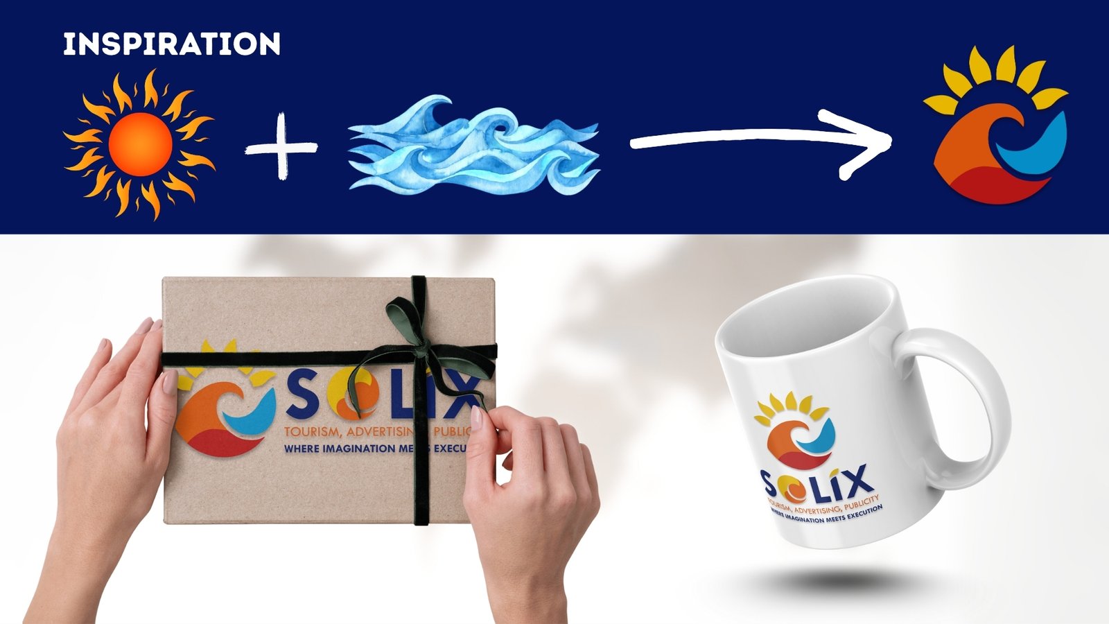
- The central sun icon represents energy, optimism, and the bright opportunities Solix offers.
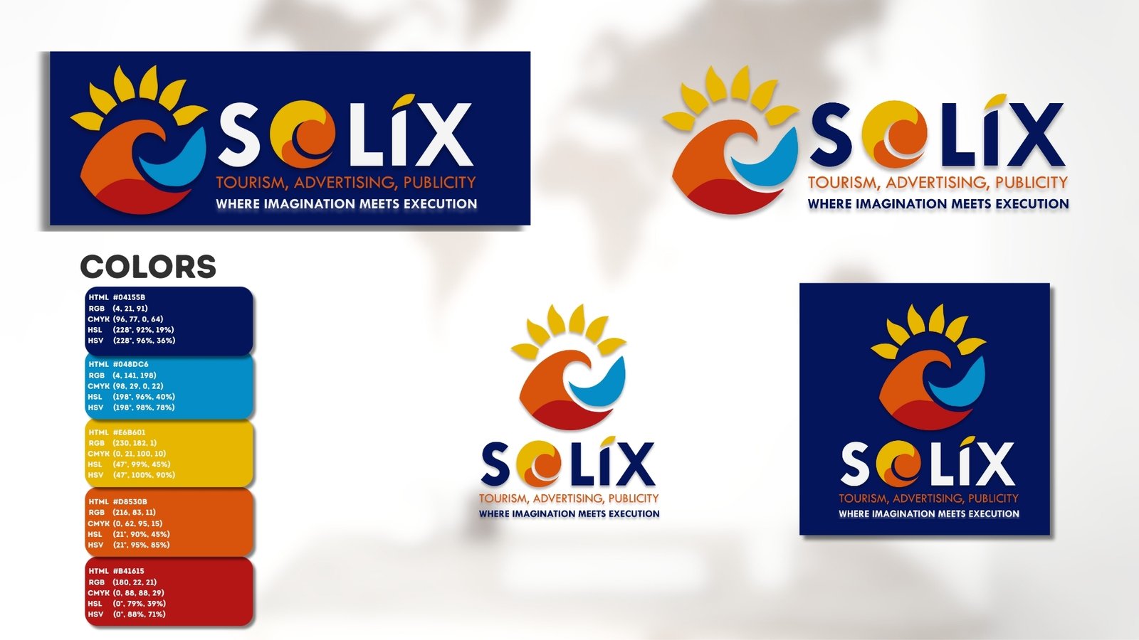
- Beneath the sun, I incorporated waves in a gradient of blue, orange, and reddish-orange, symbolizing the harmony between the sea and the sun, evoking feelings of relaxation and adventure.
- The half-disc of the sun rising above the waves conveys motion and new beginnings, reflecting Solix’s innovative and forward-thinking approach.
The color palette was carefully chosen to balance the calmness of blue with the vibrancy of orange and red, creating a professional yet creative and inviting look.
Project Success:
The logo effectively captured Solix’s dual focus on tourism and advertising, combining natural elements with a modern, eye-catching design. It became a strong visual identity for the brand, resonating with their target audience and perfectly representing the company’s core values.