
Why Responsive Web Design Matters in 2025

Introduction
In today’s fast-paced digital world, having a website is no longer enough. The way users interact with the web has changed dramatically, especially with the proliferation of mobile devices. Responsive web design (RWD) has become a cornerstone of modern web development, ensuring that websites provide a seamless experience across various devices. As we step into 2025, the importance of responsive web design is greater than ever. This blog explores why RWD is crucial, its benefits, and how businesses can stay ahead in a competitive landscape.
What is Responsive Web Design?
Responsive web design is an approach that enables websites to adapt to the screen size, resolution, and orientation of the user’s device. By using techniques like flexible grids, fluid images, and media queries, RWD ensures that users have an optimal viewing experience, whether they’re on a desktop, tablet, or smartphone.
Unlike fixed layouts that cater to specific screen sizes, responsive design dynamically adjusts, creating a user-friendly experience. It eliminates the need for separate mobile and desktop versions of a website, reducing development costs and maintenance effort.
Why It’s Crucial in 2024
User Behavior Trends
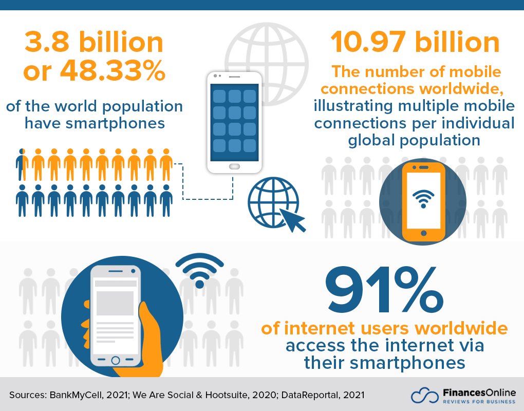
As of 2024, mobile devices account for over 60% of global web traffic. Users expect fast-loading, visually appealing websites that function seamlessly on their smartphones. A non-responsive website not only frustrates users but also drives them to competitors who prioritize mobile-friendly designs.
Competitive Edge
In an era where user expectations are high, having a responsive website is no longer optional. Businesses that fail to provide a consistent experience across devices risk losing credibility and revenue.
User Experience Matters
Statistics on Mobile Usage
- Over 80% of internet users access the web via mobile devices.
- 57% of users say they won’t recommend a business with a poorly designed mobile site.
- Mobile e-commerce sales are projected to surpass $600 billion in 2024.
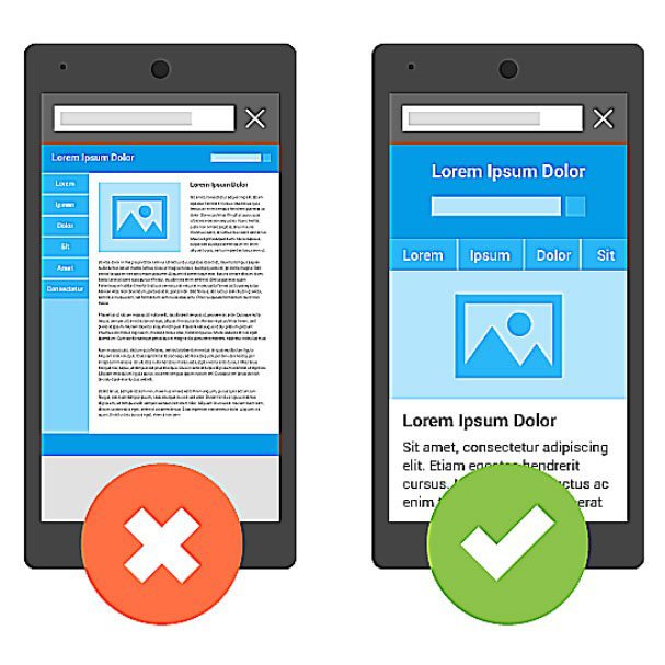
Examples of Good vs. Bad UX
- Good UX: A clothing retailer’s responsive website ensures that users can easily browse products, zoom in on images, and complete purchases on their phones.
- Bad UX: A restaurant’s non-responsive website forces users to pinch and zoom to view menus, leading to frustration and lost bookings.
SEO Benefits
Google’s Mobile-First Indexing
Google’s mobile-first indexing, introduced in 2018, has become a key factor in search rankings. This means that Google primarily uses the mobile version of a website for indexing and ranking. If your site isn’t mobile-friendly, your SEO efforts could suffer significantly.
How Responsive Design Improves Rankings
Responsive websites:
- Load faster, reducing bounce rates.
- Provide a better user experience, leading to longer site visits.
- Eliminate duplicate content issues that arise from having separate mobile and desktop versions.
Key Elements of Responsive Design
Flexible Grids
Flexible grids use relative units like percentages instead of fixed units like pixels, allowing layouts to adjust dynamically to different screen sizes.
Media Queries
Media queries are CSS rules that apply styles based on the device’s characteristics, such as width, height, and resolution. For example:
@media (max-width: 768px) {

  body {

    font-size: 14px;

  }

}
Fluid Images
Fluid images scale within their containing elements, ensuring they don’t break the layout on smaller screens. Using CSS properties like max-width: 100%; ensures images adjust proportionally.
Tools and Frameworks
Bootstrap
Bootstrap is a popular front-end framework that provides pre-designed responsive components and a grid system, making it easier to build mobile-friendly websites.
Tailwind CSS
Tailwind CSS offers utility-first classes that allow developers to create responsive designs quickly and efficiently.
Online Tools for Testing Responsiveness
- Google’s Mobile-Friendly Test: Analyze your website’s mobile usability.
- BrowserStack: Test your site on various devices and browsers.
- Responsinator: Preview your website on different screen sizes.
Conclusion
Responsive web design is no longer just a trend; it’s a necessity in 2024. With mobile usage continuing to dominate, businesses must prioritize creating responsive websites to stay competitive. By embracing RWD, you not only enhance user experience but also improve your SEO rankings and build trust with your audience. If your website isn’t responsive yet, now is the time to act and ensure your digital presence remains relevant and effective.